Showing posts with label Project. Show all posts

Wednesday, 18 September 2013

Dirty Boot - Still Life

Dirty Boot
Acrylic - A3
 
"Dirty shoes and roses can both be good in the same way." - Vincent Van Gogh

Sunday, 8 September 2013

Lilies - Still Life with Flowers

Lilies
Acrylic - A3
 
'There are always flowers for those who want to see them'
- Henri Matisse 

Monday, 8 July 2013

Drawings: OCA Part 4: Proportions II - The Longer Pose

 The Longer Pose
Oil Pastel on Green Paper
 
Thank you to my mother for once again offering (involuntarily) to be my model for this exercise. I ended up doing two drawings instead of the intended one as I wanted to experiment further with a different medium after finishing the pencil and wash piece and produced the oil pastel piece above as well. I employed the time tested artists method of holding a pencil at arm’s length to judge the right measurements and learned a valuable lesson – always ensure you’re using the same pencil for this.
The Longer Pose
Pencil and Wash
 
Learning Log
 
Have you managed to make a complete statement in this time? What were your main problems?
In the majority of my drawings there is a compete statement but I have to admit not necessarily a totally accurate one.
I find that the main problem that I am encountering is with the details of the face and hands. Working with larger mediums like pastels of thick charcoal this is not so noticeable; there is less room for details so fewer marks. However I really struggle when using finer utensils such as pencil or ink pen to record the details of faces and hands smoothly and succinctly. I know his is all down to a matter of practicing it so practice it I shall do.
How well have you captured the characteristics of the pose?
When I stayed focused and concentrated on each mark that I made the character of the pose definitely came through much stronger and produced a more satisfying drawing. However sometimes I would get bogged down in certain areas and loose some of that individual personality.
Do the proportions look right? If not, how will you try to improve this?
Surprisingly I think the proportions of my figures are generally quite good, at times the faces and hands are a bit off as mentioned before, so I shall practice to hopefully improve in the future. Otherwise I don’t think they are at all that bad I found that using objects in the background to relate to really helped to get the scale right.
Preparatory Sketch
Biro and Marker Pen

Tuesday, 2 July 2013

Drawings: OCA Part 4: Proportions I - Quick Poses

Marker Pen on Scrap Paper
 
Now onto the fourth part of my drawing course and it is time for some figure drawing, a subject that always seems to be very hit and miss with me. I know I can produce some very good figure drawings but at the same time I’m prone to some awful ones too, shall just have to see how it goes.
 
Producing these quick drawings in a few minutes was quite refreshing after spending hours on the same drawing of a tree and such like. Although it was challenging to capture the character of the subjects in such a short time, sometimes it started to come through surprisingly quickly with just a few well chosen lines.
 

Biro Pen on A4 Cartridge Paper
 

Marker Pen and Biro (L) - Soft Pastel (R)


Biro Pen (L) - Pencil (R)

Friday, 21 June 2013

Drawings: OCA Part 3: Assignment 3

Assignment Three - Drawing Outdoors Final Piece
Graphite and Chalk on Coloured Paper
 
First off I have to say that this assignment was hard, or more specifically finding the right view to work from was the hard part. I needed a view from a window or doorway that included natural objects (i.e. plants, trees etc) had a sense of depth to demonstrate some perspective as well as some straight-lined objects. I found looking out of any window covered a couple of these criteria but they all seemed a bit, well, bland. So when I finally found this view I knew that this was the one I was going to work from, it had a linear perspective in the buildings and some trees in the foreground and the church gave an interesting background.
 
So, having found my chosen view I set about playing around with the composition and decided on a portrait format that I felt showed the depth of the drawing well. I then experimented with the perspective of the buildings to ensure that I had it all right. After this I decided to eliminate one of the background buildings and I am glad I did this as it helps the church to be more dominant in the background.
I experimented with a watercolour and pen drawing that I decided not to pursue, it did not feel like the right media for the piece; I wanted to work with something that showed off the setting better. After a bit more exploration I decided I really liked the way chalk and graphite worked against each other, especially on the coloured paper as a mid-tone. The media manages to capture something of the feel of the place quite well.
I ended up spending a couple of hours creating the final piece and I am really satisfied with the result. My only concerns are that I may have lost some of the depth in the final drawing and that I should have explored some more choices of media that may have showed certain elements off better.

Experimenting with Composition
Biro on Paper
 
Pencil Sketch (left) and Working out Perspective (right)


Watercolour and Pen Piece (left) and Charcoal Sketch of the Same Tree (right)
 
First try with Chalk and Graphite on Coloured Paper

Thursday, 20 June 2013

Drawings: OCA Part 3: Drawing Trees III - Study of Several Trees

Study of Several Trees
Ink on Paper - A3
 
Study of Several Trees - Silver Birches
Fine Liner on Paper - A4
Learning Log
 
How many different tree types have you drawn?
I am definitely no expert on trees but I’ve definitely had a go at drawing quite a few different types, oak, elm and birches at least.
What techniques did you use to distinguish each type?
I was not really focusing on analyzing the type of tree I was drawing but more on the individual tree itself and the way it had adapted to its own environment. To achieve this I concentrated on its own particular characteristics i.e. the shape and direction of its branches and sometimes detailing some of the leaves, this acts like a fingerprint to identify the type of tree it is.
What did you do to convey the mass of foliage?
Once I had plotted out the basic shape of the tree and all its elements, I would identify how the branches interact with the foliage, how bits clumped together and the direction they went in. I did a bit of experimentation but I found that being loose with the detail works best, just enough to give an impression of the foliage. I think this works best because when viewing a tree you do not register all the leaves and twigs individually, you tend to think of it as one united object.
I used very simple marks in the fine liner drawing of the birches, slightly messy marks because the foliage seemed to scribble its way around the trees.
How did you handle the light on the trees? Was it successful?
In the individual tree drawings once I had described enough of the rough details, I shaded with the intention of seeing the entire tree as one object. This allowed me to keep similar levels of light and dark continuing through the entire drawing, so the darkest points stayed as the darkest points without getting lost. I also attempted to capture the way the light shone through the clumps of foliage in places, almost glittering amongst the greenery, by concentrating on the details.
In the group of trees I produced in ink there is a much starker contrast because of the media, although less subtle this did allow me to maintain a consistent level easily. In the fine-liner drawing of the birches, the second colour of the green sort of acted as a mid-tone in places.
Did you manage to select and simplify? Look at your drawings and make notes on how you did this, and what could you do better?
After finishing this project I can conclude that knowing what to select and what to simplify is really quite tricky, include too much and it will make for an uncomfortable drawing, too little and the piece will seem unfinished, wanting more.
In the study of the oak tree and the elm tree in the second exercise I think I did this quite successfully, I spent a lot of time picking out the important details to include and eliminating those elements that seemed less important. In the group studies I think I may have simplified possibly too much in places, though I am very happy with the texture the ink was able to convey.
Overall I think I have done quite well in this project I am pleased with the results and I have definitely enjoyed working through it. Trees are still one of my favourite subjects and I shall no doubt return to them in the not too distant future.
 

Wednesday, 19 June 2013

Drawings: OCA Part 3: Drawing Trees I - Sketching an Individual Tree

Sketching an Individual Tree - Small Sketches


'Like people, trees are all individuals.'
- David Hockney
 
Sketching an Individual Tree - St James Park
Pencil on Paper
 
Trees are a subject that I always love to draw, no two trees will ever be the same, and they are an infinite supply of inspiration. Indeed, no two drawings of the same tree will be the same either as they are always continuously changing colour and shape, through the seasons etc.
It is also the process of drawing trees that I find enjoyable, starting with the basic shape and building up the mass of the drawing, adding in details such as twigs and leaves that might catch my eye and lend a distinct character to the drawing and individual tree.

Quick Sketches of Trees
Ink and Biro (Left) . Charcoal (Right)
 
Tree in  Local Park
Pastel on Coloured Paper
 

Wednesday, 12 June 2013

Drawings: OCA Part 3: Townscapes IV - Drawing Statues


Statue of Peter Pan - Kensington Gardens
Pencil on Paper

Preliminary Sketch
Pencil on Paper
 
Learning Log
How did you use a limited colour palette to create a sense of depth?
Looking over my limited palette pieces I have to admit that creating a sense of depth was not something I concentrated on specifically, I tended to focus on the details of the buildings. However the buildings I chose to draw do have the feel of receding in places, but mostly due to the composition and the view I decided to draw from. I established the main focus and intensified the amount of colour and detail in these areas, causing other spaces to taper away into the background.
Did your preliminary sketches give you enough information for your final pieces of work?
I tended to include as much information as possible and then decide what to leave out later, so for the most part the answer is yes, however some pieces I had to abandon after reassessing sketches.
Would you approach this task differently another time?
I am quite proud and content with the pieces that I have produced, that’s not to say that all of them are great drawings, so I would not do it differently as such, only carry on exploring the subject more thoroughly.
Have you got the scale of the buildings right? Make notes on what worked and what didn’t.
I think the scale is correct for most of the buildings, establishing my eye line really helped this as well as plotting everything out first before filling in details. These definitely were not drawings that could be rushed, I had to maintain concentration and think about the angle and size of any structural line I put in.
Have you captured the colour and atmosphere in your studies? How did you do this?
Some of the architecture I chose to draw was quite imposing and powerfully prominent and I think I managed to replicate this impression in my drawings by intensifying it.
The statues were also very striking and prominent so I decided on a very close view to gain the sense of awe when looking up at them from below. This can be seen clearly in my sketch of G. F. Watts’ Physical Energy where I was sitting on the ground to draw.
When I was drawing Rodin’s The Burghers of Calais the atmosphere was quite different, though none the less impressive or prominent that the other statues I have drawn, the sense was focused more towards the solemnity and the feelings of the individuals it portrayed, all with a different emotion. I chose one figure hidden behind the others that cowers away clasping his head, wanting desperately not to be seen. To try and get the same atmosphere in my drawing was a challenge, I decided to try and almost hide him away in the drawing.
Rodin's Burghers of Calais - Victoria Tower Gardens
Charcoal on Green Paper

G. F. Watt's Physical Energy - Kensington Gardens
Graphite and Coloured Pencil on Paper

Friday, 17 May 2013

Drawings: OCA Part 2: Assignment 2

Final Piece
Watercolour and Pencil - A3 

For this assignment I knew I wanted to produce something full of colour, so I started playing around with drawing and sketching different pieces of fruit like onions and chillies, trying out different media as I went.
I initially really liked the idea of the chillies and went ahead with the idea, adding in some green herbs to enhance the colour and using the same view point (from above) that I thought worked well in the fish on plate piece from earlier in the project. I like these pieces but having reviewed the criteria for this assignment again, I was not confident that I had really completed it as well as I could with the composition or colour, probably because I rushed into doing it.
I was not particularly enthusiastic about doing another ink piece at this point so I went back and tried using a combination of pencil and watercolour on some small drawings of fruit. I really liked the way these turned out so I continued with this idea. I also thought a lot longer about the composition I would use, sketching out different ideas first. I added a simple jug that had quite a natural curve like the fruit and eventually a pot plant at the back that gave the arrangement some height and presence. Once I had finalised the composition I produced a couple of studies to make sure I was happy with the lighting and positioning of the all the items and then started on the final piece.
I first sketched the whole thing out in pencil, ensuring that the scale and shading was right. I used the cross-hatching method because I knew it would help to define the shapes well. With the watercolour, I built up layers of separate tones, building it up most where the darker tones were present and leaving the highlighted parts almost bare. It took quite a while to do it this way but I am fairly pleased with the result.

 Study of Red Onions
Watercolour and Biro - A4
 
Initial Studies and Sketches


First result that I was not happy with
 
 
Starting Over with some Watercolour Studies


Playing around with Composition


Practice before Final Piece
Watercolour and Pencil
 Pros:
-          My favourite thing about this piece is definitely the colours; I specifically choose the lemons, limes and satsumas because I thought the colours contrasted well, giving each piece of fruit its own separate form.

-          The cross-hatching works well to define the shapes.
Cons:
-          Despite all the planning for it, I’m still not entirely happy with the composition; I think I preferred it in some of the study pieces as opposed to the final drawing.

-          Looking at it now I think I should have thought more about filling in the background to give the piece a better setting.

Tuesday, 5 February 2013

Drawings: OCA - Assignment One

Natural Still Life
Brown and Black Indian Ink on A2 Paper
 
Made Objects Still Life
Ink and Wash on A2 Paper
 
I decided to try the made objects for my first drawing, I took the idea of things found in my pockets and thought about drawing keys as they have a range of interesting, very clean cut unnatural shapes. I tried sketching out a few studies and found that employing the hatching method worked very well and helped emphasise the shapes of the keys. I added a few more objects that worked well with the keys such as the locks and whistle, playing around and trying an ink and wash drawing. I liked the variety but found the result very scattered so I added the watch to bring a focal point to the drawing.
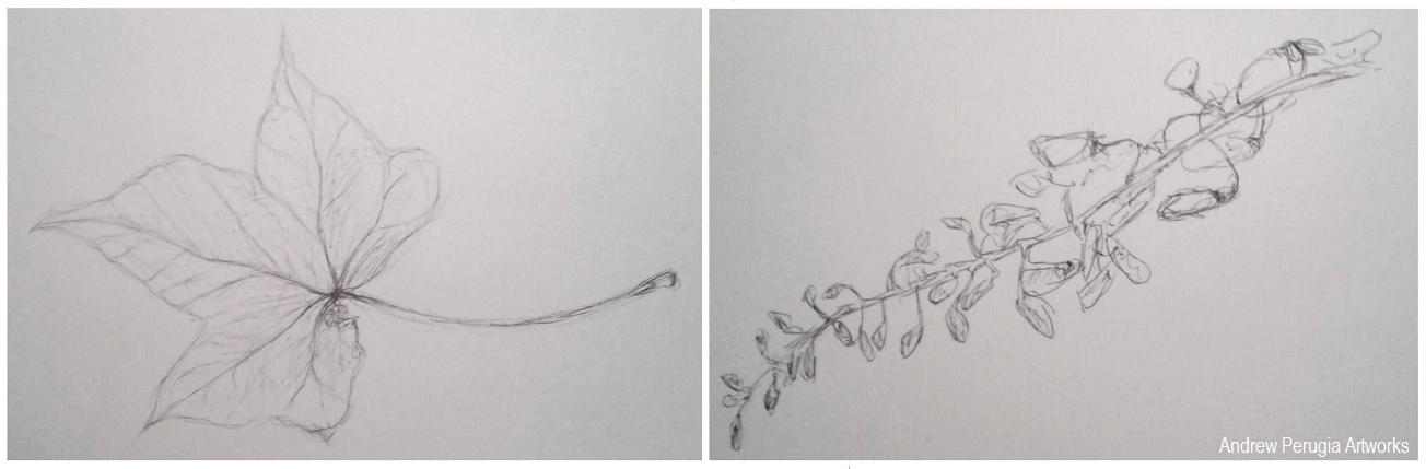
I saved the Natural forms drawing till last and started by doing some studies of different leaves. I found I liked the Ivy leaves best so I went back and drew a few in brown and black Indian inks with a dip pen; I really liked the result the earthy colours worked well. I gathered some more natural objects and sketched these all individually. I liked the Cyprus seeds as these worked well with the dip pen and inks and I thought the small details the wisteria flower heads would complement the broad ivy leaves. I played around with the composition to try and fully cover the paper, literally branching into all the corners.
Sketchbook Pages- Playing around with the composition.
 
Did you do enough preliminary work before starting work on your final pieces?
I think I could have done with doing a bit more playing around with the composition for my first piece of the made objects, I did quite a bit for the second piece of the natural objects, and I feel this arrangement maybe turned out better because of it. It really helped to make sure I was using the right materials though.
Do your large drawings give an accurate interpretation of the still life groups? If not, what went wrong?
I believe they are fairly accurate, the dip pens and earthy brown colour really helped to achieve the right feel in the natural forms. Some of the keys I’m not entirely happy with as the shapes are a little off in places.
Did you make a good selection of objects or did you try to include too much? Would you change the arrangements of objects if you were to start again?
Looking back I think I may have fallen into the trap of using too many objects, I have to contradict myself though because I also quite like them for it. If changed them at all I would try and make objects fill all the corners of the page better.
Do your drawings fit well on the paper or could they be improved by working on a larger sheet of paper?
I think the scale of these two pieces is quite good, it worked well with the media but if I was using something bolder like pastels I might have struggled a bit more.
Did you have problems with drawing or find hatching too difficult?
I really went for it with the hatching on the first drawing of the made objects, it was a lot of work on all the different keys and locks but I think I pulled it off. I held back and tried to do it with a bit more subtlety on the second piece, and again I think it worked.
 
 Study of a chub key and playing with ink and wash for Made objects
 
 Studies of an Ivy Leaf and Wisteria Flower heads.
 
Indian Ink Studies of Ivy Leaves and Cyprus Seeds

Wednesday, 8 August 2012

Drawings: OCA Project - Still Life


Composition of Natural Objects.
Indian Ink on A4 Paper

Do you think it is easier to suggest three dimensions on man-made or natural objects?

It is definitely easier to define the shapes of man-made objects in three-dimensions because they are made up of regular geometric shapes with corners and faces. Natural objects such as fruit and plants do not conform to these regularities and tend to have lumps and bumps that make a subject harder to define.

How did you create a sense of solidity in your composition?

I used black Indian ink applied with a brush to lay down some bold defining lines. These lines helped to give the drawing a sense of depth as the black seemed dense and heavy against the white of the paper. Then I added water to some of the black ink to dilute it for the mid-tone wash; helping to bind the dark and light tones of the drawing together.

Do you think changing the arrangement of your composition makes a difference to your approach and the way you create a sense of form?

I think it was good to experiment with different compositions before starting on the final drawing as it helped me to find an interesting layout for my objects that was still comfortable to draw. It also helped me to see how different objects could interact and play off each other to convey the sense of form.

How did you decide to position yourself in relation to the objects?

I decided I wanted to view the objects from a slightly elevated position this gave me a good view of all the objects together and of the shadows cast by the light coming in from the right hand side. I also liked this position because the fruit formed a sort of triangular arrangement and the flower stems seemed intertwine around all the gaps.

Photos of sketchbook pages


Still life sketches of made objects & Natural object composition arrangements.
Both in Black Ballpoint Pen