Showing posts with label Leaves. Show all posts

Thursday, 20 June 2013

Drawings: OCA Part 3: Drawing Trees III - Study of Several Trees

Study of Several Trees
Ink on Paper - A3
 
Study of Several Trees - Silver Birches
Fine Liner on Paper - A4
Learning Log
 
How many different tree types have you drawn?
I am definitely no expert on trees but I’ve definitely had a go at drawing quite a few different types, oak, elm and birches at least.
What techniques did you use to distinguish each type?
I was not really focusing on analyzing the type of tree I was drawing but more on the individual tree itself and the way it had adapted to its own environment. To achieve this I concentrated on its own particular characteristics i.e. the shape and direction of its branches and sometimes detailing some of the leaves, this acts like a fingerprint to identify the type of tree it is.
What did you do to convey the mass of foliage?
Once I had plotted out the basic shape of the tree and all its elements, I would identify how the branches interact with the foliage, how bits clumped together and the direction they went in. I did a bit of experimentation but I found that being loose with the detail works best, just enough to give an impression of the foliage. I think this works best because when viewing a tree you do not register all the leaves and twigs individually, you tend to think of it as one united object.
I used very simple marks in the fine liner drawing of the birches, slightly messy marks because the foliage seemed to scribble its way around the trees.
How did you handle the light on the trees? Was it successful?
In the individual tree drawings once I had described enough of the rough details, I shaded with the intention of seeing the entire tree as one object. This allowed me to keep similar levels of light and dark continuing through the entire drawing, so the darkest points stayed as the darkest points without getting lost. I also attempted to capture the way the light shone through the clumps of foliage in places, almost glittering amongst the greenery, by concentrating on the details.
In the group of trees I produced in ink there is a much starker contrast because of the media, although less subtle this did allow me to maintain a consistent level easily. In the fine-liner drawing of the birches, the second colour of the green sort of acted as a mid-tone in places.
Did you manage to select and simplify? Look at your drawings and make notes on how you did this, and what could you do better?
After finishing this project I can conclude that knowing what to select and what to simplify is really quite tricky, include too much and it will make for an uncomfortable drawing, too little and the piece will seem unfinished, wanting more.
In the study of the oak tree and the elm tree in the second exercise I think I did this quite successfully, I spent a lot of time picking out the important details to include and eliminating those elements that seemed less important. In the group studies I think I may have simplified possibly too much in places, though I am very happy with the texture the ink was able to convey.
Overall I think I have done quite well in this project I am pleased with the results and I have definitely enjoyed working through it. Trees are still one of my favourite subjects and I shall no doubt return to them in the not too distant future.
 

Drawings: OCA Part 3: Drawing Trees II - Larger Study of an Individual Tree

 Larger Study of an Individual Tree - Oak Tree
Pencil on Paper - A3
 
'In nature, nothing is perfect and everything is perfect. Trees can be contorted, bent in weird ways, and they're still beautiful.'
- Alice Walker
 
Elm Tree
Biro on Coloured Paper
 
I loved this exercise and the results of it. I started out with the drawing at the bottom of this post but had to abandon it after about fifteen minutes because it started to rain, the grey clouds should have given me an idea it would but I ignored them, fool that I am. Despite being unfinished I thought I would include it because I do quite like it, who knows, I may go back and try to complete it one day.
On a day with somewhat better weather I started the second piece in this post, the elm tree was within a mass of foliage so I thought the coloured paper might help to give an impression of this, I used biro because it would show up well against the green.
The last piece I completed was the large oak tree (first picture in this post) this particular tree caught my attention while I was in holiday in Cornwall because it had a wall built right up to it and because it dominated its surroundings but seemed calm and subdued at the same time.
I tried to concentrate on getting the ‘sense of directionality’ that the exercise asked for, letting the drawing grow mirroring the same way the tree itself has done, from a basic trunk and the extending its reach further and further. I tried to work fats and to keep up the tempo but I still spent at least an hour on the elm tree and probably more like three hours on the oak tree, I think the results have definitely been worth it though. I’m happy that I have managed to capture both the dominant presence of the oak as well as some of its intricate delicacy.
 
Abandoned Piece
Pencil on Paper

Wednesday, 19 June 2013

Drawings: OCA Part 3: Drawing Trees I - Sketching an Individual Tree

Sketching an Individual Tree - Small Sketches


'Like people, trees are all individuals.'
- David Hockney
 
Sketching an Individual Tree - St James Park
Pencil on Paper
 
Trees are a subject that I always love to draw, no two trees will ever be the same, and they are an infinite supply of inspiration. Indeed, no two drawings of the same tree will be the same either as they are always continuously changing colour and shape, through the seasons etc.
It is also the process of drawing trees that I find enjoyable, starting with the basic shape and building up the mass of the drawing, adding in details such as twigs and leaves that might catch my eye and lend a distinct character to the drawing and individual tree.

Quick Sketches of Trees
Ink and Biro (Left) . Charcoal (Right)
 
Tree in  Local Park
Pastel on Coloured Paper
 

Tuesday, 5 February 2013

Drawings: OCA - Assignment One

Natural Still Life
Brown and Black Indian Ink on A2 Paper
 
Made Objects Still Life
Ink and Wash on A2 Paper
 
I decided to try the made objects for my first drawing, I took the idea of things found in my pockets and thought about drawing keys as they have a range of interesting, very clean cut unnatural shapes. I tried sketching out a few studies and found that employing the hatching method worked very well and helped emphasise the shapes of the keys. I added a few more objects that worked well with the keys such as the locks and whistle, playing around and trying an ink and wash drawing. I liked the variety but found the result very scattered so I added the watch to bring a focal point to the drawing.
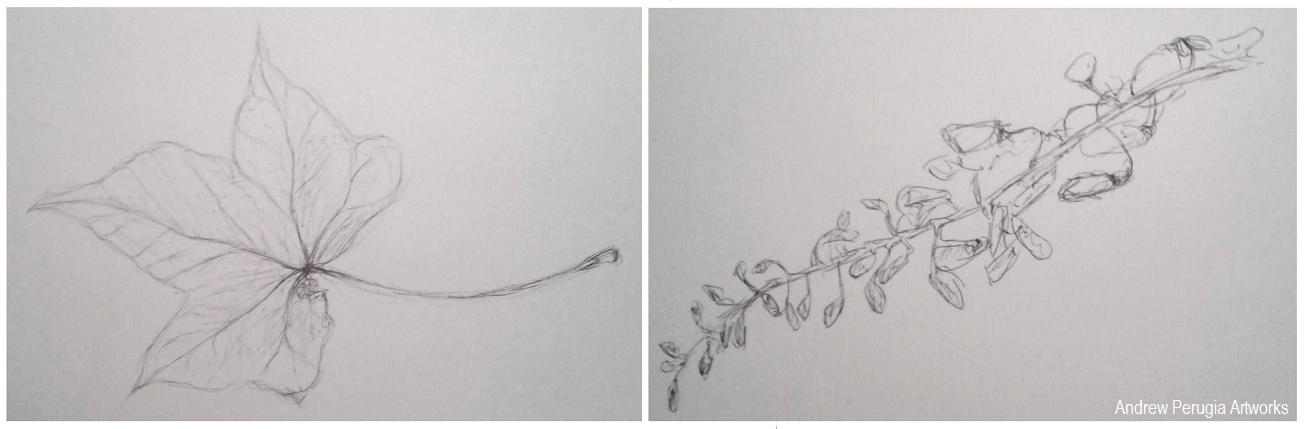
I saved the Natural forms drawing till last and started by doing some studies of different leaves. I found I liked the Ivy leaves best so I went back and drew a few in brown and black Indian inks with a dip pen; I really liked the result the earthy colours worked well. I gathered some more natural objects and sketched these all individually. I liked the Cyprus seeds as these worked well with the dip pen and inks and I thought the small details the wisteria flower heads would complement the broad ivy leaves. I played around with the composition to try and fully cover the paper, literally branching into all the corners.
Sketchbook Pages- Playing around with the composition.
 
Did you do enough preliminary work before starting work on your final pieces?
I think I could have done with doing a bit more playing around with the composition for my first piece of the made objects, I did quite a bit for the second piece of the natural objects, and I feel this arrangement maybe turned out better because of it. It really helped to make sure I was using the right materials though.
Do your large drawings give an accurate interpretation of the still life groups? If not, what went wrong?
I believe they are fairly accurate, the dip pens and earthy brown colour really helped to achieve the right feel in the natural forms. Some of the keys I’m not entirely happy with as the shapes are a little off in places.
Did you make a good selection of objects or did you try to include too much? Would you change the arrangements of objects if you were to start again?
Looking back I think I may have fallen into the trap of using too many objects, I have to contradict myself though because I also quite like them for it. If changed them at all I would try and make objects fill all the corners of the page better.
Do your drawings fit well on the paper or could they be improved by working on a larger sheet of paper?
I think the scale of these two pieces is quite good, it worked well with the media but if I was using something bolder like pastels I might have struggled a bit more.
Did you have problems with drawing or find hatching too difficult?
I really went for it with the hatching on the first drawing of the made objects, it was a lot of work on all the different keys and locks but I think I pulled it off. I held back and tried to do it with a bit more subtlety on the second piece, and again I think it worked.
 
 Study of a chub key and playing with ink and wash for Made objects
 
 Studies of an Ivy Leaf and Wisteria Flower heads.
 
Indian Ink Studies of Ivy Leaves and Cyprus Seeds

Saturday, 24 December 2011

Drawings: Some Christmas Holly

Pencil on Cartridge Paper

I created this piece today, especially for the festive season, of some holly leaves and berries. Drawing Santa or a snowman didn’t really seem ‘arty’ enough but I thought I could get away with this simple but seasonal sketch.
I used pencils to draw with for this piece, creating a rough sketch first to get an idea of the composition, before adding details like the veins and shadow.
One last thing to say and that’s Merry Christmas!

Tuesday, 13 December 2011

Paintings: Summery Tree


Acrylics on Cartridge Paper 14"x13"
Bit of an antithesis to the current season but I am putting this piece up as a reminder of how colourful and alive the trees were in summer compared to now, and because I quite like it.
I used palette knives to apply all the paint on this piece, this was the first time I’d used them on paper, so it was an interesting experience, I still prefer using them on board or canvas though.
To start the piece off, I used some blue acrylic mixed with white to show the patches where that warm, clear summer sky would be peaking through the foliage of the tree. I then started on the branches to get the shape of the tree before beginning the fun part; the leaves. I went a bit crazy with these which is probably why the final result is a lot rougher than I had anticipated but I am not too disappointed with it. I put quite a bit of yellow into the leaves because they often seem to have a yellowish gleam to them where they reflect the sun.


Thursday, 27 October 2011

Some Arboreal Botherations

Watercolour on A2 Cartridge Paper

I used watercolour to create this piece of a lonely oak tree on the side of a slope. I went slightly mad with this piece, incorporating any colour or means of applying the paint that took my fancy.
I started with the main trunk of the tree, deciding against including a distinct background of any sorts, so I sketched it all out in a light burnt sienna. Then I filled in much of the main trunk and the thicker branches with various brown hues adding touches of sap green to give the impression of some mossy patches clinging onto the bark. I also gave a slight hint of the hill upon which this oak tree grew with a faint wash of sap green at the base to give this tree something to grasp on to. I was quite pleased at this stage, but then I started on the foliage and that’s were it started to go downhill in my opinion.
I started on the leaves with another sap green wash, like with the hill at the tree base and then suggesting some more frondescent details using a hookers green applied with a rigger brush. I was still quite happy at this stage, but this is where I began to go a little bit crazy with the colour. I thought I would give it a more autumnal mood by utilising some warmer pigments to the foliage with some cadmium yellows, oranges and a light red. I applied these colours by flicking them onto the surface with an old toothbrush dipped into the mixed colours in the hope that it would add little flourishes. I’m not totally convinced this has worked but I don’t think the piece is a complete disappointment, and others have said they liked it so maybe my efforts with this piece were not completely wasted in vain.

Friday, 21 October 2011

Plaster Re-Leaf


Plaster Relief of Leaves 8.5" x 4"

So this is something that I had never tried before until a few weeks ago; Using moulds to create plaster reliefs. I started by carving a few basic leafy shapes into a slab of old clay to form a mould, into which I poured some wet plaster and left it to dry out. This was the result of my first try. Considering it is a method that I've never employed before I'm pleasantly suprised and quite satisfied with it.
I did have a go at using plaster last year on my art foundation course however I never seemed to get any decent results, I would just inevitably just end up staring at a sloppy white mess.
So yes, considering everything I am quite happy with this, I think Plaster reliefs are a good cross between a drawing and a sculptural pieces. Oh, and I hope my corny joke in the title of this post is appreciated.