Showing posts with label Biro. Show all posts

Monday, 8 July 2013

Drawings: OCA Part 4: Proportions II - The Longer Pose

 The Longer Pose
Oil Pastel on Green Paper
 
Thank you to my mother for once again offering (involuntarily) to be my model for this exercise. I ended up doing two drawings instead of the intended one as I wanted to experiment further with a different medium after finishing the pencil and wash piece and produced the oil pastel piece above as well. I employed the time tested artists method of holding a pencil at arm’s length to judge the right measurements and learned a valuable lesson – always ensure you’re using the same pencil for this.
The Longer Pose
Pencil and Wash
 
Learning Log
 
Have you managed to make a complete statement in this time? What were your main problems?
In the majority of my drawings there is a compete statement but I have to admit not necessarily a totally accurate one.
I find that the main problem that I am encountering is with the details of the face and hands. Working with larger mediums like pastels of thick charcoal this is not so noticeable; there is less room for details so fewer marks. However I really struggle when using finer utensils such as pencil or ink pen to record the details of faces and hands smoothly and succinctly. I know his is all down to a matter of practicing it so practice it I shall do.
How well have you captured the characteristics of the pose?
When I stayed focused and concentrated on each mark that I made the character of the pose definitely came through much stronger and produced a more satisfying drawing. However sometimes I would get bogged down in certain areas and loose some of that individual personality.
Do the proportions look right? If not, how will you try to improve this?
Surprisingly I think the proportions of my figures are generally quite good, at times the faces and hands are a bit off as mentioned before, so I shall practice to hopefully improve in the future. Otherwise I don’t think they are at all that bad I found that using objects in the background to relate to really helped to get the scale right.
Preparatory Sketch
Biro and Marker Pen

Tuesday, 2 July 2013

Drawings: OCA Part 4: Proportions I - Quick Poses

Marker Pen on Scrap Paper
 
Now onto the fourth part of my drawing course and it is time for some figure drawing, a subject that always seems to be very hit and miss with me. I know I can produce some very good figure drawings but at the same time I’m prone to some awful ones too, shall just have to see how it goes.
 
Producing these quick drawings in a few minutes was quite refreshing after spending hours on the same drawing of a tree and such like. Although it was challenging to capture the character of the subjects in such a short time, sometimes it started to come through surprisingly quickly with just a few well chosen lines.
 

Biro Pen on A4 Cartridge Paper
 

Marker Pen and Biro (L) - Soft Pastel (R)


Biro Pen (L) - Pencil (R)

Friday, 21 June 2013

Drawings: OCA Part 3: Assignment 3

Assignment Three - Drawing Outdoors Final Piece
Graphite and Chalk on Coloured Paper
 
First off I have to say that this assignment was hard, or more specifically finding the right view to work from was the hard part. I needed a view from a window or doorway that included natural objects (i.e. plants, trees etc) had a sense of depth to demonstrate some perspective as well as some straight-lined objects. I found looking out of any window covered a couple of these criteria but they all seemed a bit, well, bland. So when I finally found this view I knew that this was the one I was going to work from, it had a linear perspective in the buildings and some trees in the foreground and the church gave an interesting background.
 
So, having found my chosen view I set about playing around with the composition and decided on a portrait format that I felt showed the depth of the drawing well. I then experimented with the perspective of the buildings to ensure that I had it all right. After this I decided to eliminate one of the background buildings and I am glad I did this as it helps the church to be more dominant in the background.
I experimented with a watercolour and pen drawing that I decided not to pursue, it did not feel like the right media for the piece; I wanted to work with something that showed off the setting better. After a bit more exploration I decided I really liked the way chalk and graphite worked against each other, especially on the coloured paper as a mid-tone. The media manages to capture something of the feel of the place quite well.
I ended up spending a couple of hours creating the final piece and I am really satisfied with the result. My only concerns are that I may have lost some of the depth in the final drawing and that I should have explored some more choices of media that may have showed certain elements off better.

Experimenting with Composition
Biro on Paper
 
Pencil Sketch (left) and Working out Perspective (right)


Watercolour and Pen Piece (left) and Charcoal Sketch of the Same Tree (right)
 
First try with Chalk and Graphite on Coloured Paper

Thursday, 20 June 2013

Drawings: OCA Part 3: Drawing Trees II - Larger Study of an Individual Tree

 Larger Study of an Individual Tree - Oak Tree
Pencil on Paper - A3
 
'In nature, nothing is perfect and everything is perfect. Trees can be contorted, bent in weird ways, and they're still beautiful.'
- Alice Walker
 
Elm Tree
Biro on Coloured Paper
 
I loved this exercise and the results of it. I started out with the drawing at the bottom of this post but had to abandon it after about fifteen minutes because it started to rain, the grey clouds should have given me an idea it would but I ignored them, fool that I am. Despite being unfinished I thought I would include it because I do quite like it, who knows, I may go back and try to complete it one day.
On a day with somewhat better weather I started the second piece in this post, the elm tree was within a mass of foliage so I thought the coloured paper might help to give an impression of this, I used biro because it would show up well against the green.
The last piece I completed was the large oak tree (first picture in this post) this particular tree caught my attention while I was in holiday in Cornwall because it had a wall built right up to it and because it dominated its surroundings but seemed calm and subdued at the same time.
I tried to concentrate on getting the ‘sense of directionality’ that the exercise asked for, letting the drawing grow mirroring the same way the tree itself has done, from a basic trunk and the extending its reach further and further. I tried to work fats and to keep up the tempo but I still spent at least an hour on the elm tree and probably more like three hours on the oak tree, I think the results have definitely been worth it though. I’m happy that I have managed to capture both the dominant presence of the oak as well as some of its intricate delicacy.
 
Abandoned Piece
Pencil on Paper

Wednesday, 19 June 2013

Drawings: OCA Part 3: Drawing Trees I - Sketching an Individual Tree

Sketching an Individual Tree - Small Sketches


'Like people, trees are all individuals.'
- David Hockney
 
Sketching an Individual Tree - St James Park
Pencil on Paper
 
Trees are a subject that I always love to draw, no two trees will ever be the same, and they are an infinite supply of inspiration. Indeed, no two drawings of the same tree will be the same either as they are always continuously changing colour and shape, through the seasons etc.
It is also the process of drawing trees that I find enjoyable, starting with the basic shape and building up the mass of the drawing, adding in details such as twigs and leaves that might catch my eye and lend a distinct character to the drawing and individual tree.

Quick Sketches of Trees
Ink and Biro (Left) . Charcoal (Right)
 
Tree in  Local Park
Pastel on Coloured Paper
 

Tuesday, 4 June 2013

Drawings: OCA Part 3: Perspective

South Corner of Berkeley Square - Angular Perspective
Pen on Paper

Learning Log
What Problems did you find in executing perspective drawings?
Perspective drawings tend to be very precise and so any details of the drawing which are slightly off the mark stand out like a sore thumb. Getting all the features to match up is very difficult, especially when drawing on the spot.
Make notes on the merits of using or not using rulers to guide you.
 
Using a ruler helps to get over the problem mentioned before but relying on it results in a drawing that looks very rigid and characterless in my opinion. I prefer to map out a perspective drawing using the ruler before going over these marks freehand, allowing a touch of spontaneity, and details that may not come through otherwise.  Also there are inevitably buildings or objects at a slightly different angle to the rest that will not conform to exactly the same vanishing point, these turn out better when judging them against ones done by ruler.

Parallel Perspective - An Interior View
Pencil on Paper

Friday, 17 May 2013

Drawings: OCA Part 2: Assignment 2

Final Piece
Watercolour and Pencil - A3 

For this assignment I knew I wanted to produce something full of colour, so I started playing around with drawing and sketching different pieces of fruit like onions and chillies, trying out different media as I went.
I initially really liked the idea of the chillies and went ahead with the idea, adding in some green herbs to enhance the colour and using the same view point (from above) that I thought worked well in the fish on plate piece from earlier in the project. I like these pieces but having reviewed the criteria for this assignment again, I was not confident that I had really completed it as well as I could with the composition or colour, probably because I rushed into doing it.
I was not particularly enthusiastic about doing another ink piece at this point so I went back and tried using a combination of pencil and watercolour on some small drawings of fruit. I really liked the way these turned out so I continued with this idea. I also thought a lot longer about the composition I would use, sketching out different ideas first. I added a simple jug that had quite a natural curve like the fruit and eventually a pot plant at the back that gave the arrangement some height and presence. Once I had finalised the composition I produced a couple of studies to make sure I was happy with the lighting and positioning of the all the items and then started on the final piece.
I first sketched the whole thing out in pencil, ensuring that the scale and shading was right. I used the cross-hatching method because I knew it would help to define the shapes well. With the watercolour, I built up layers of separate tones, building it up most where the darker tones were present and leaving the highlighted parts almost bare. It took quite a while to do it this way but I am fairly pleased with the result.

 Study of Red Onions
Watercolour and Biro - A4
 
Initial Studies and Sketches


First result that I was not happy with
 
 
Starting Over with some Watercolour Studies


Playing around with Composition


Practice before Final Piece
Watercolour and Pencil
 Pros:
-          My favourite thing about this piece is definitely the colours; I specifically choose the lemons, limes and satsumas because I thought the colours contrasted well, giving each piece of fruit its own separate form.

-          The cross-hatching works well to define the shapes.
Cons:
-          Despite all the planning for it, I’m still not entirely happy with the composition; I think I preferred it in some of the study pieces as opposed to the final drawing.

-          Looking at it now I think I should have thought more about filling in the background to give the piece a better setting.

Thursday, 9 May 2013

Drawings OCA Part 2 V: Project - Drawing Animals - Grabbing the Chance

Deer Resting in Richmond Park
Charcoal - A3

 Deer in the Grass, Richmond Park
Charcoal - A4
 
Definitely an easier said than done task, animals don’t tend to want to stay still, especially with me sitting next to them scratching away with a pencil.
Like the last exercise, this is another subject that I am not overly experienced in working with, but after doing a bit of research into artists like Mark Adlington and how they have responded to the subject I at least felt a bit more enthusiastic about tackling it.
My favourite part of this exercise was visiting Richmond Park where the fallow deer were surprisingly accommodating to having me sit and sketch quite close to them. I also quickly learnt that they were more likely to stay still for a longer period if I drew them from behind or while they were dozing in the sun.
There also some more sketches below that I completed for this exercise of a donkey and a puppy.
I really like the loose feeling in the ink and charcoal drawings of the Richmond Park deer, I think this was unintentionally achieved by me adapting to drawing outside with limited tools and the need to capture something quickly before my models ran away.

 Deer Resting, Richmond Park
Blue Ink - A4


Deer Standing, Richmond Park
Blue Ink - A4


Deer in Richmond Park Sketches
Pencil - A4


Sleeping Puppy Sketch
Biro Pen - A4
 
Donkeys Grazing
Pencil - A4

Donkey Resting
Charcoal - A4

Saturday, 9 February 2013

Drawings: OCA Project - Detailed Observation


Line Drawing Detail
Fine Liner - A4
 
I thought a sliced through lettuce was ideal for this exercise, the swirling lines are almost like a labyrinth and it was an interesting process capturing them as they narrowed and broadened themselves all over the place.


Getting Tone and Depth in Detail
Pencil - A3


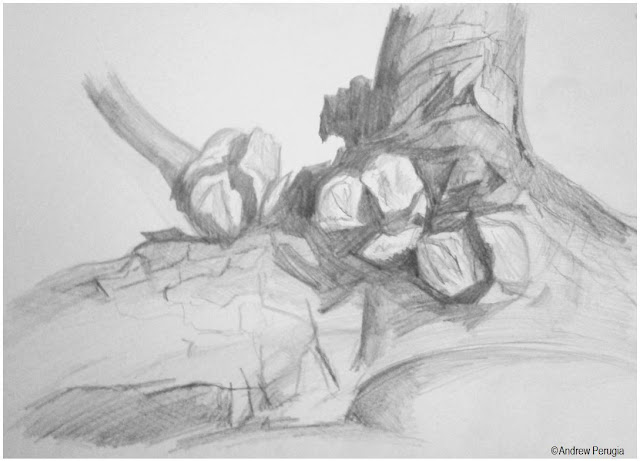
I chose a piece of firewood from our woodpile for this exercise, it’s a sawn off bit of a Cyprus tree with the seeds still attached. I used a range of pencils to hatch at different angles, it was hard picking out the different tonal values but I think I did alright.

Stipples and Dots
Ballpoint - A4
 
I found this poor thing clinging on to the end of its stem in the garden and thought it had some quite interesting and different textures to draw; I used a biro to try and capture them all. Though I can’t honestly say that I’m happy with the result it was still a good drawing experience.
 
Which drawing media did you find most effective to use, for which effects?
A fine liner is really useful for doing a strong clear line and it results in a very tidy drawing but a pencil is definitely more subtle. I like both and in the future I shall think a bit more about which to use before I start a drawing.
What sort of marks work well to create tone, pattern and texture?
I find I like hatching provided I have enough tonal differences in the subject that I’m drawing. Stippling gives an interesting texture but I don’t think that I chose the best object to try it on.
Did you enjoy capturing details or are you more at home creating big broad brusg strokes?
I like capturing different aspects of a subject and detail in certain parts can really lift it. I definitely like doing the broader sketches but I think if I can combine the two, then they might play off each other quite nicely.
Look at the composition of the drawings you hav done in this project. Make some sketches and notes about how you could improve your composition.

I drew the dead flower head in situ so I didn’t really put much thought into the composition but I could have played around with that a bit more. On the piece of wood I zoomed right in to get a close look but I could have added some more interest to the background and provide some sort of context for it.
Did doing a line drawing get you to look at space more effectively?
Definitely, it made me think twice before putting a line down to check that everything would fit where I wanted it too.


Friday, 23 December 2011

Drawings: Jugs and Jars

Biro on A4 Cartridge Paper

This is a still life piece that I have just done for a drawing project on my art course. I was focusing on the ellipses of the lids and cylindrical shapes of the various vessels.
I used some biros pens to create this piece, varying the tones by use of cross hatching. I used the hatching strokes almost like contours, following the shapes of the cylinders; I find this helps to give the objects some body.
After finishing this piece I then altered my view of the objects slightly and created a second piece from my new position to see how the shapes and ellipses changed. I think I prefer the first piece but I found the process of doing the second one quite interesting.
By the way, I realise that there aren’t any jugs in this piece but that is the name of the exercise.

Biro on A4 Cartridge Paper