Showing posts with label Sketchbook. Show all posts

Monday, 8 July 2013

Drawings: OCA Part 4: Proportions II - The Longer Pose

 The Longer Pose
Oil Pastel on Green Paper
 
Thank you to my mother for once again offering (involuntarily) to be my model for this exercise. I ended up doing two drawings instead of the intended one as I wanted to experiment further with a different medium after finishing the pencil and wash piece and produced the oil pastel piece above as well. I employed the time tested artists method of holding a pencil at arm’s length to judge the right measurements and learned a valuable lesson – always ensure you’re using the same pencil for this.
The Longer Pose
Pencil and Wash
 
Learning Log
 
Have you managed to make a complete statement in this time? What were your main problems?
In the majority of my drawings there is a compete statement but I have to admit not necessarily a totally accurate one.
I find that the main problem that I am encountering is with the details of the face and hands. Working with larger mediums like pastels of thick charcoal this is not so noticeable; there is less room for details so fewer marks. However I really struggle when using finer utensils such as pencil or ink pen to record the details of faces and hands smoothly and succinctly. I know his is all down to a matter of practicing it so practice it I shall do.
How well have you captured the characteristics of the pose?
When I stayed focused and concentrated on each mark that I made the character of the pose definitely came through much stronger and produced a more satisfying drawing. However sometimes I would get bogged down in certain areas and loose some of that individual personality.
Do the proportions look right? If not, how will you try to improve this?
Surprisingly I think the proportions of my figures are generally quite good, at times the faces and hands are a bit off as mentioned before, so I shall practice to hopefully improve in the future. Otherwise I don’t think they are at all that bad I found that using objects in the background to relate to really helped to get the scale right.
Preparatory Sketch
Biro and Marker Pen

Tuesday, 2 July 2013

Drawings: OCA Part 4: Proportions I - Quick Poses

Marker Pen on Scrap Paper
 
Now onto the fourth part of my drawing course and it is time for some figure drawing, a subject that always seems to be very hit and miss with me. I know I can produce some very good figure drawings but at the same time I’m prone to some awful ones too, shall just have to see how it goes.
 
Producing these quick drawings in a few minutes was quite refreshing after spending hours on the same drawing of a tree and such like. Although it was challenging to capture the character of the subjects in such a short time, sometimes it started to come through surprisingly quickly with just a few well chosen lines.
 

Biro Pen on A4 Cartridge Paper
 

Marker Pen and Biro (L) - Soft Pastel (R)


Biro Pen (L) - Pencil (R)

Wednesday, 12 June 2013

Drawings: OCA Part 3: Townscapes IV - Drawing Statues


Statue of Peter Pan - Kensington Gardens
Pencil on Paper

Preliminary Sketch
Pencil on Paper
 
Learning Log
How did you use a limited colour palette to create a sense of depth?
Looking over my limited palette pieces I have to admit that creating a sense of depth was not something I concentrated on specifically, I tended to focus on the details of the buildings. However the buildings I chose to draw do have the feel of receding in places, but mostly due to the composition and the view I decided to draw from. I established the main focus and intensified the amount of colour and detail in these areas, causing other spaces to taper away into the background.
Did your preliminary sketches give you enough information for your final pieces of work?
I tended to include as much information as possible and then decide what to leave out later, so for the most part the answer is yes, however some pieces I had to abandon after reassessing sketches.
Would you approach this task differently another time?
I am quite proud and content with the pieces that I have produced, that’s not to say that all of them are great drawings, so I would not do it differently as such, only carry on exploring the subject more thoroughly.
Have you got the scale of the buildings right? Make notes on what worked and what didn’t.
I think the scale is correct for most of the buildings, establishing my eye line really helped this as well as plotting everything out first before filling in details. These definitely were not drawings that could be rushed, I had to maintain concentration and think about the angle and size of any structural line I put in.
Have you captured the colour and atmosphere in your studies? How did you do this?
Some of the architecture I chose to draw was quite imposing and powerfully prominent and I think I managed to replicate this impression in my drawings by intensifying it.
The statues were also very striking and prominent so I decided on a very close view to gain the sense of awe when looking up at them from below. This can be seen clearly in my sketch of G. F. Watts’ Physical Energy where I was sitting on the ground to draw.
When I was drawing Rodin’s The Burghers of Calais the atmosphere was quite different, though none the less impressive or prominent that the other statues I have drawn, the sense was focused more towards the solemnity and the feelings of the individuals it portrayed, all with a different emotion. I chose one figure hidden behind the others that cowers away clasping his head, wanting desperately not to be seen. To try and get the same atmosphere in my drawing was a challenge, I decided to try and almost hide him away in the drawing.
Rodin's Burghers of Calais - Victoria Tower Gardens
Charcoal on Green Paper

G. F. Watt's Physical Energy - Kensington Gardens
Graphite and Coloured Pencil on Paper

Tuesday, 11 June 2013

Drawings: OCA Part 3: Townscapes II - A Sketchbook of Townscape Drawings

 St James St and National Portrait Gallery
Pencil on Paper
 
It really is surprisingly difficult just to stand at the side of the road in the middle of London and sketch; it is so different from any other kind of drawing situation with all the noise and distractions going on constantly all around me. I began to feel very self conscious at times, not embarrassed but hyperaware of being a hindrance to other people, worried that cars were going to stop expecting me to cross and such. Once I got more involved in the drawings though I began to ignore any niggling insecurities.


Tuesday, 4 June 2013

Drawings: OCA Part 3: Perspective

South Corner of Berkeley Square - Angular Perspective
Pen on Paper

Learning Log
What Problems did you find in executing perspective drawings?
Perspective drawings tend to be very precise and so any details of the drawing which are slightly off the mark stand out like a sore thumb. Getting all the features to match up is very difficult, especially when drawing on the spot.
Make notes on the merits of using or not using rulers to guide you.
 
Using a ruler helps to get over the problem mentioned before but relying on it results in a drawing that looks very rigid and characterless in my opinion. I prefer to map out a perspective drawing using the ruler before going over these marks freehand, allowing a touch of spontaneity, and details that may not come through otherwise.  Also there are inevitably buildings or objects at a slightly different angle to the rest that will not conform to exactly the same vanishing point, these turn out better when judging them against ones done by ruler.

Parallel Perspective - An Interior View
Pencil on Paper

Tuesday, 21 May 2013

Drawings: OCA Part 3: Landscape Drawing II - 360 Degree Studies


360 Degree Studies - Bossiney Bay
Pencil - 4 x A4
 
In this exercise I needed to be standing in one spot and drawing the view towards the north, east, south and west.  I chose a spot on the cliffs above Bossiney Bay so that I would have four very different drawings, in different directions I could see buildings, trees, rocks and the sea.

Thursday, 9 May 2013

Drawings OCA Part 2 V: Project - Drawing Animals - Grabbing the Chance

Deer Resting in Richmond Park
Charcoal - A3

 Deer in the Grass, Richmond Park
Charcoal - A4
 
Definitely an easier said than done task, animals don’t tend to want to stay still, especially with me sitting next to them scratching away with a pencil.
Like the last exercise, this is another subject that I am not overly experienced in working with, but after doing a bit of research into artists like Mark Adlington and how they have responded to the subject I at least felt a bit more enthusiastic about tackling it.
My favourite part of this exercise was visiting Richmond Park where the fallow deer were surprisingly accommodating to having me sit and sketch quite close to them. I also quickly learnt that they were more likely to stay still for a longer period if I drew them from behind or while they were dozing in the sun.
There also some more sketches below that I completed for this exercise of a donkey and a puppy.
I really like the loose feeling in the ink and charcoal drawings of the Richmond Park deer, I think this was unintentionally achieved by me adapting to drawing outside with limited tools and the need to capture something quickly before my models ran away.

 Deer Resting, Richmond Park
Blue Ink - A4


Deer Standing, Richmond Park
Blue Ink - A4


Deer in Richmond Park Sketches
Pencil - A4


Sleeping Puppy Sketch
Biro Pen - A4
 
Donkeys Grazing
Pencil - A4

Donkey Resting
Charcoal - A4

Saturday, 2 March 2013

Drawings: OCA Part 2 III: Project - Drawing Fruit and Vegetables in Colour - Part III

Exercise: Drawing Using Oil Pastel
& Learning Log
 
 Final Drawing: Apples, Lemons and Baby Tomatoes
Oil Pastel - A3 Yellow Textured Paper
 
For this exercise I first started to play around with the composition, I was using a couple of tangerines and apples to try and get some strong contrast between the greens and oranges. I found a composition that I was happy with and attempted a quick drawing of this with oil pastels on a piece of A4 paper. I like the result and I think the contrast works really well, however there isn’t much range in shape or size so I added some lemons into the arrangement.

I decided to try and use a textured green coloured paper but it soon became apparent after I had started filling in some of the colour that I had made the wrong choice. I did a quick experiment on some textured yellow coloured paper and found this worked much better. I also made a last minute decision to swap the tangerines for some baby tomatoes to vary the range of shapes and sizes a bit more.

I used a chrome yellow to sketch in the main shapes as it was neutral colour that was not too heavy and was apparent in all the pieces of fruit. I then used a Van Dyke Brown to pick out the darkest areas before getting started on the rest. I used a bit of vermillion in the baby tomatoes, yellow ochre in these and the lemons. I found that a yellow grey pastel I had was the perfect tone for the apples as well as the shadow cast by everything. I was aware of how colours from some pieces of fruit were reflected in other, such as the green from the apples being seen in the lemons too, this helped to intensify the colours a bit more, giving a much stronger visual impact. I found that the colours worked really well together and against the yellow paper, it did take quite a while to build up the layers on it but I am very pleased with the final result.
 
Composition studies
Charcoal - A4

Study of apples and Tangerines
Oil Pastel - A4
Learning Log

Your composition should occupy most of the paper’s surface. How much negative space do you have left?
In terms of the way the composition fits onto the page, I would say I have done quite well. The subjects in my pieces sit quite comfortably without feeling like they are crammed onto the paper but also not getting swamped by extra space.
The piece I did of the apple with two lemons using the dip pens is a bit tight as the shadow is quite near the left edge, this is because I didn’t plot out the shadow before I went ahead with it so it could do with shifting to the right a bit.
I purposely left some negative space between the fruit in the final pastel drawing. I did this so that I could get a balance between drawing the pieces of fruit individually as well as allowing them to intersect each other in places.

What have you learned from drawing the details of fruit and vegetables?
I have learnt to try and think about the objects a lot more before I begin to draw them, and to work out how some will work well together and others maybe not so much. It was also interesting to try and capture the different textures of each individual piece of fruit whilst trying to maintain the relationship between them and keep the feeling that they are all part of the same drawing.

What did you find the most challenging about this part of the course?
It was difficult to know whether a composition would really work until I started to actually draw it, this is where doing the sketches for the last piece first really helped.
 
Experiments on Coloured Paper
Oil Pastel - A4


Friday, 1 March 2013

Drawings: OCA Part 2 III: Project - Drawing Fruit and Vegetables in Colour - Part II

Exercise: Using Markers or Dip Pens
 
 Orange, Pear and Lemons
Marker Pens - A4

Apple, Pear, Orange and Lemon
Marker Pens - A4
 
 Apple, Oranges and Lemons
Marker Pens - A4
 
I really enjoyed this exercise, both the process and the results captured my interest. Using coloured marker pens to draw with was a fairly new thing for me, I have never tried sketching anything out with them properly, so it was with a bit of trepidation that I began this exercise. It all turned out fine though and I became engrossed in building up the hatching, using the bold lines that are inevitable with marker pens. I had quite a good range of markers to utilise in these drawings and after some experimentation i dicovered that layering the dark blue and red close to each other formed a great dark tone for the shadowy parts.
 
I also produced a couple of drawings with the use of ink and dip pens. I have used dip pens before in my first assignment, but I stuck to black and sepia then, unlike in this exercise. I approached each drawing differently intentionally. With the first one I washed some rather bold strokes onto the paper with a brush, layering the red over the green where it was darkest and sketching the details in afterwards with a dip pen and black ink. The second drawing I did completely with a dip pen similar to my marker pen pieces, building up the hatching on different planes.
 
 
 Two Apples
Washed Ink and Dip Pens - A4
 
Apple and Lemons
Pen and Ink - A4


Tuesday, 5 February 2013

Drawings: OCA - Assignment One

Natural Still Life
Brown and Black Indian Ink on A2 Paper
 
Made Objects Still Life
Ink and Wash on A2 Paper
 
I decided to try the made objects for my first drawing, I took the idea of things found in my pockets and thought about drawing keys as they have a range of interesting, very clean cut unnatural shapes. I tried sketching out a few studies and found that employing the hatching method worked very well and helped emphasise the shapes of the keys. I added a few more objects that worked well with the keys such as the locks and whistle, playing around and trying an ink and wash drawing. I liked the variety but found the result very scattered so I added the watch to bring a focal point to the drawing.
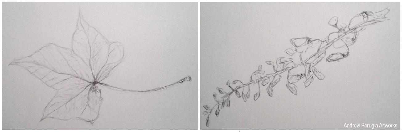
I saved the Natural forms drawing till last and started by doing some studies of different leaves. I found I liked the Ivy leaves best so I went back and drew a few in brown and black Indian inks with a dip pen; I really liked the result the earthy colours worked well. I gathered some more natural objects and sketched these all individually. I liked the Cyprus seeds as these worked well with the dip pen and inks and I thought the small details the wisteria flower heads would complement the broad ivy leaves. I played around with the composition to try and fully cover the paper, literally branching into all the corners.
Sketchbook Pages- Playing around with the composition.
 
Did you do enough preliminary work before starting work on your final pieces?
I think I could have done with doing a bit more playing around with the composition for my first piece of the made objects, I did quite a bit for the second piece of the natural objects, and I feel this arrangement maybe turned out better because of it. It really helped to make sure I was using the right materials though.
Do your large drawings give an accurate interpretation of the still life groups? If not, what went wrong?
I believe they are fairly accurate, the dip pens and earthy brown colour really helped to achieve the right feel in the natural forms. Some of the keys I’m not entirely happy with as the shapes are a little off in places.
Did you make a good selection of objects or did you try to include too much? Would you change the arrangements of objects if you were to start again?
Looking back I think I may have fallen into the trap of using too many objects, I have to contradict myself though because I also quite like them for it. If changed them at all I would try and make objects fill all the corners of the page better.
Do your drawings fit well on the paper or could they be improved by working on a larger sheet of paper?
I think the scale of these two pieces is quite good, it worked well with the media but if I was using something bolder like pastels I might have struggled a bit more.
Did you have problems with drawing or find hatching too difficult?
I really went for it with the hatching on the first drawing of the made objects, it was a lot of work on all the different keys and locks but I think I pulled it off. I held back and tried to do it with a bit more subtlety on the second piece, and again I think it worked.
 
 Study of a chub key and playing with ink and wash for Made objects
 
 Studies of an Ivy Leaf and Wisteria Flower heads.
 
Indian Ink Studies of Ivy Leaves and Cyprus Seeds

Wednesday, 8 August 2012

Drawings: OCA Project - Still Life


Composition of Natural Objects.
Indian Ink on A4 Paper

Do you think it is easier to suggest three dimensions on man-made or natural objects?

It is definitely easier to define the shapes of man-made objects in three-dimensions because they are made up of regular geometric shapes with corners and faces. Natural objects such as fruit and plants do not conform to these regularities and tend to have lumps and bumps that make a subject harder to define.

How did you create a sense of solidity in your composition?

I used black Indian ink applied with a brush to lay down some bold defining lines. These lines helped to give the drawing a sense of depth as the black seemed dense and heavy against the white of the paper. Then I added water to some of the black ink to dilute it for the mid-tone wash; helping to bind the dark and light tones of the drawing together.

Do you think changing the arrangement of your composition makes a difference to your approach and the way you create a sense of form?

I think it was good to experiment with different compositions before starting on the final drawing as it helped me to find an interesting layout for my objects that was still comfortable to draw. It also helped me to see how different objects could interact and play off each other to convey the sense of form.

How did you decide to position yourself in relation to the objects?

I decided I wanted to view the objects from a slightly elevated position this gave me a good view of all the objects together and of the shadows cast by the light coming in from the right hand side. I also liked this position because the fruit formed a sort of triangular arrangement and the flower stems seemed intertwine around all the gaps.

Photos of sketchbook pages


Still life sketches of made objects & Natural object composition arrangements.
Both in Black Ballpoint Pen

Tuesday, 20 December 2011

Sketchbook: Rainy Archways

Indian Ink in A4 Sketchbook

I created this piece in one of my sketchbooks a while ago of the inside of a ruined cathedral. I really liked the drama of the place, this great gothic ruin in the rain, forming huge puddles in the middle of the stone floor.
I used some Indian ink, beginning with a light wash and working some darker tones into it while it was still wet. This let some of the tones bleed into each other. I quite like the effect, all the elements working together to create quite a simple but likeable piece of art.

Thursday, 15 December 2011

Sketchbook: A Wintery Watercolour Tree

Watercolour in A5 Sketchbook

I’m being a bit inconsistent with my last post, but this time I thought I’d be faithful to the current season and put up a rather more wintery looking piece. This maple tree caught my eye with its bare branches looking almost skeletal, just looking at it makes me feel cold and shivery.
This was just a quick sketchbook piece so I used watercolours, sticking to yellow ochre for the light patches and a dark brown for the shadowy tones.

Monday, 28 November 2011

Drawings: Fallen Tree on the Canal

Pencil on A5 Cartridge Paper

I created this drawing over the weekend while I was a way on a narrow boat, chugging along the Grand Union Canal. This fallen tree, extending over the side of the bank and dipping its branches in the canal, creating some delicate ripples caught my eye. I used a few different pencils to try and quickly capture it in my sketchbook before it passed.


Friday, 25 November 2011

Sketchbook: Still Life Watercolour

Watercolour on A5 Cartridge Paper

This is the first Still life piece I have featured on this blog and the first that I have done for quite a while. I used a small branch and a sprig of something I discovered in my garden; trying to avoid a very cliché still life I arranged the two bits in a rather ugly plastic soft drinks bottle. Although I didn’t want it to look like a typical still life, I did want it to allude to one, which I think this has achieved.
I used watercolours on this piece as it was only intended as a quick study to begin with. I limited my palette to mostly cool colours, pairing the hues of blue and green in the bottle and the green sprig on the left. The only warm colours used were a touch of red brown and yellow ochre in the branch on the right.

Tuesday, 15 November 2011

Sketchbook: Inky Trees

Indian Ink on A5 Cartridge Paper

This was a really quick sketchbook piece I created using some black Indian ink. I found a couple of skeletal looking trees completely bare of any leaves and sat down to draw.
I avoided using any brushes or pens in this piece, instead I simply used a folded strip of cartridge paper dipped in the ink and dragged this across the surface of the paper to form marks. I managed to attain some different levels of tone just by simply using different amounts of ink on the paper. I think this has worked especially well on the tree trunks where I made sure the paper was very dry before dragging it with a slight curve to give the impression of the curved shape and the roughness of the bark.
The branches seemed to weave in and out of each other, almost not knowing where to go without their leaves to cover them. To try and convey this in the piece I used a straw to blow some of the ink, so I wasn’t in complete control of where the ink would go, this helped to get the branches feeling busier and more natural looking.
P.S. Yay for it being my Tenth Post!

Friday, 28 October 2011

Sketchbook: Some Seasonal Spruces

Watercolour in A5 Sketchbook

Autumn seems to be speeding along at quite a pace so while we are still in the midst of it I thought I would capture a little bit of this all too short-lived season in my sketchbook with this warm watercolour painting of a line of leafy autumnal trees in the park.
I employed a limited palette of some typically warm autumnal reds and yellow ochre’s for the majority of this sketchbook piece, as it was intended as just a quick composition to look back on for future work. However, having completed it, I am quite pleased with the ultimate result. It is quite a simple representation, I didn’t try to capture anything more detailed than a fleeting impression of the subject but there is something in the simplicity of it that I appreciate and regard as quite engaging.
P.S. I googled it and apparently these trees aren't technically spruces but then my alliterative title wouldn't have worked.