Saturday, 2 March 2013

Drawings: OCA Part 2 III: Project - Drawing Fruit and Vegetables in Colour - Part III

Exercise: Drawing Using Oil Pastel
& Learning Log
 
 Final Drawing: Apples, Lemons and Baby Tomatoes
Oil Pastel - A3 Yellow Textured Paper
 
For this exercise I first started to play around with the composition, I was using a couple of tangerines and apples to try and get some strong contrast between the greens and oranges. I found a composition that I was happy with and attempted a quick drawing of this with oil pastels on a piece of A4 paper. I like the result and I think the contrast works really well, however there isn’t much range in shape or size so I added some lemons into the arrangement.

I decided to try and use a textured green coloured paper but it soon became apparent after I had started filling in some of the colour that I had made the wrong choice. I did a quick experiment on some textured yellow coloured paper and found this worked much better. I also made a last minute decision to swap the tangerines for some baby tomatoes to vary the range of shapes and sizes a bit more.

I used a chrome yellow to sketch in the main shapes as it was neutral colour that was not too heavy and was apparent in all the pieces of fruit. I then used a Van Dyke Brown to pick out the darkest areas before getting started on the rest. I used a bit of vermillion in the baby tomatoes, yellow ochre in these and the lemons. I found that a yellow grey pastel I had was the perfect tone for the apples as well as the shadow cast by everything. I was aware of how colours from some pieces of fruit were reflected in other, such as the green from the apples being seen in the lemons too, this helped to intensify the colours a bit more, giving a much stronger visual impact. I found that the colours worked really well together and against the yellow paper, it did take quite a while to build up the layers on it but I am very pleased with the final result.
 
Composition studies
Charcoal - A4

Study of apples and Tangerines
Oil Pastel - A4
Learning Log

Your composition should occupy most of the paper’s surface. How much negative space do you have left?
In terms of the way the composition fits onto the page, I would say I have done quite well. The subjects in my pieces sit quite comfortably without feeling like they are crammed onto the paper but also not getting swamped by extra space.
The piece I did of the apple with two lemons using the dip pens is a bit tight as the shadow is quite near the left edge, this is because I didn’t plot out the shadow before I went ahead with it so it could do with shifting to the right a bit.
I purposely left some negative space between the fruit in the final pastel drawing. I did this so that I could get a balance between drawing the pieces of fruit individually as well as allowing them to intersect each other in places.

What have you learned from drawing the details of fruit and vegetables?
I have learnt to try and think about the objects a lot more before I begin to draw them, and to work out how some will work well together and others maybe not so much. It was also interesting to try and capture the different textures of each individual piece of fruit whilst trying to maintain the relationship between them and keep the feeling that they are all part of the same drawing.

What did you find the most challenging about this part of the course?
It was difficult to know whether a composition would really work until I started to actually draw it, this is where doing the sketches for the last piece first really helped.
 
Experiments on Coloured Paper
Oil Pastel - A4


Friday, 1 March 2013

Drawings: OCA Part 2 III: Project - Drawing Fruit and Vegetables in Colour - Part II

Exercise: Using Markers or Dip Pens
 
 Orange, Pear and Lemons
Marker Pens - A4

Apple, Pear, Orange and Lemon
Marker Pens - A4
 
 Apple, Oranges and Lemons
Marker Pens - A4
 
I really enjoyed this exercise, both the process and the results captured my interest. Using coloured marker pens to draw with was a fairly new thing for me, I have never tried sketching anything out with them properly, so it was with a bit of trepidation that I began this exercise. It all turned out fine though and I became engrossed in building up the hatching, using the bold lines that are inevitable with marker pens. I had quite a good range of markers to utilise in these drawings and after some experimentation i dicovered that layering the dark blue and red close to each other formed a great dark tone for the shadowy parts.
 
I also produced a couple of drawings with the use of ink and dip pens. I have used dip pens before in my first assignment, but I stuck to black and sepia then, unlike in this exercise. I approached each drawing differently intentionally. With the first one I washed some rather bold strokes onto the paper with a brush, layering the red over the green where it was darkest and sketching the details in afterwards with a dip pen and black ink. The second drawing I did completely with a dip pen similar to my marker pen pieces, building up the hatching on different planes.
 
 
 Two Apples
Washed Ink and Dip Pens - A4
 
Apple and Lemons
Pen and Ink - A4


Drawings: OCA Part 2 III: Project - Drawing Fruit and Vegetables in Colour

Exercise: Using Hatching to Create Tone
 
 Studies of an Apple and Oranges
Watercolour Pencil - A4
 
 Studies of a Banana and an Apple
Highlighter - A4

Two Oranges and Lime in Wooden Bowl
Colour Pencil - A4
 
Redrawn Close-up of Previous Drawing 

I started this exercise using watercolour pencils in the first piece, beginning with the lighter ones and building the lines with darker ones like the purple and royal blues. I also experimented with highlighters though I can’t say I’m particularly pleased with the result but it was interesting to do.
 
I then positioned two oranges and a lime in a bowl and used colour pencil to draw this arrangement. I placed the bowl near a lamp to cause some strong tonal contrast and I think the highlight with the white pencil show this particularly well.
 
Just for curiosity as to whether this technique would also work well on a larger scale I used a viewfinder on the drawing and produced another one that increases the size of part of the original.


Tuesday, 12 February 2013

Drawings: OCA Part 2 II: Project - Still Life Revisited

Still Life Group in Tone
Oil Pastel A4
 
Because I wasn't entirely happy with my original attempt at this exercise as seen in my last post i decided to revisit it and have another go.
This time I stuck to cooler colours at the bluer end of the spectrum but used the same compositon so that i could compare the two results once finished. I definitely prefer this one, i find it a lot fresher and it feels much more harmonious.

Monday, 11 February 2013

Drawings: OCA Part 2 II: Project - Still Life

 Still Life Group using Line
Fine Liner and wash A3
 
Still Life Group in Tone
Oil Pastel A4
 
What aspects of each drawing have been successful, and what did you have problems with?
I really like the still life group using line, especially the mushroom and onion, these definitely worked well because of their shapes and textures. Unfortunately I feel the melon in the background was less successful, I found the texture was hard to capture correctly.
I can’t say the drawing of the still life group in tone is one that I particularly like but it did at least make me think about the tones more, as a positive I do like the colours I chose.
Did you manage to get a sense of depth in your drawings? What elements of the drawings and still life groups helped to create that sense?
The first drawing has a bit of depth to it and I think this was helped by the composition and the way that the objects build up as they go further into the drawing. If I’m honest I think the second piece is definitely lacking this.
What difficulties were created by being restricted to line or tone?
I found the main difficulty was that I wanted to be creative but the rules were quite prohibitive; I had to learn not to indulge the urge to be spontaneous. I also think that it is quite hard to accurately describe the objects without a combination of the two elements of line and tone.


Saturday, 9 February 2013

Drawings: OCA Project - Detailed Observation


Line Drawing Detail
Fine Liner - A4
 
I thought a sliced through lettuce was ideal for this exercise, the swirling lines are almost like a labyrinth and it was an interesting process capturing them as they narrowed and broadened themselves all over the place.


Getting Tone and Depth in Detail
Pencil - A3


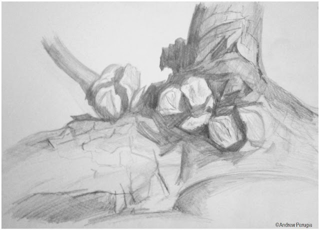
I chose a piece of firewood from our woodpile for this exercise, it’s a sawn off bit of a Cyprus tree with the seeds still attached. I used a range of pencils to hatch at different angles, it was hard picking out the different tonal values but I think I did alright.

Stipples and Dots
Ballpoint - A4
 
I found this poor thing clinging on to the end of its stem in the garden and thought it had some quite interesting and different textures to draw; I used a biro to try and capture them all. Though I can’t honestly say that I’m happy with the result it was still a good drawing experience.
 
Which drawing media did you find most effective to use, for which effects?
A fine liner is really useful for doing a strong clear line and it results in a very tidy drawing but a pencil is definitely more subtle. I like both and in the future I shall think a bit more about which to use before I start a drawing.
What sort of marks work well to create tone, pattern and texture?
I find I like hatching provided I have enough tonal differences in the subject that I’m drawing. Stippling gives an interesting texture but I don’t think that I chose the best object to try it on.
Did you enjoy capturing details or are you more at home creating big broad brusg strokes?
I like capturing different aspects of a subject and detail in certain parts can really lift it. I definitely like doing the broader sketches but I think if I can combine the two, then they might play off each other quite nicely.
Look at the composition of the drawings you hav done in this project. Make some sketches and notes about how you could improve your composition.

I drew the dead flower head in situ so I didn’t really put much thought into the composition but I could have played around with that a bit more. On the piece of wood I zoomed right in to get a close look but I could have added some more interest to the background and provide some sort of context for it.
Did doing a line drawing get you to look at space more effectively?
Definitely, it made me think twice before putting a line down to check that everything would fit where I wanted it too.


Tuesday, 5 February 2013

Drawings: OCA - Assignment One

Natural Still Life
Brown and Black Indian Ink on A2 Paper
 
Made Objects Still Life
Ink and Wash on A2 Paper
 
I decided to try the made objects for my first drawing, I took the idea of things found in my pockets and thought about drawing keys as they have a range of interesting, very clean cut unnatural shapes. I tried sketching out a few studies and found that employing the hatching method worked very well and helped emphasise the shapes of the keys. I added a few more objects that worked well with the keys such as the locks and whistle, playing around and trying an ink and wash drawing. I liked the variety but found the result very scattered so I added the watch to bring a focal point to the drawing.
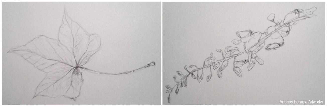
I saved the Natural forms drawing till last and started by doing some studies of different leaves. I found I liked the Ivy leaves best so I went back and drew a few in brown and black Indian inks with a dip pen; I really liked the result the earthy colours worked well. I gathered some more natural objects and sketched these all individually. I liked the Cyprus seeds as these worked well with the dip pen and inks and I thought the small details the wisteria flower heads would complement the broad ivy leaves. I played around with the composition to try and fully cover the paper, literally branching into all the corners.
Sketchbook Pages- Playing around with the composition.
 
Did you do enough preliminary work before starting work on your final pieces?
I think I could have done with doing a bit more playing around with the composition for my first piece of the made objects, I did quite a bit for the second piece of the natural objects, and I feel this arrangement maybe turned out better because of it. It really helped to make sure I was using the right materials though.
Do your large drawings give an accurate interpretation of the still life groups? If not, what went wrong?
I believe they are fairly accurate, the dip pens and earthy brown colour really helped to achieve the right feel in the natural forms. Some of the keys I’m not entirely happy with as the shapes are a little off in places.
Did you make a good selection of objects or did you try to include too much? Would you change the arrangements of objects if you were to start again?
Looking back I think I may have fallen into the trap of using too many objects, I have to contradict myself though because I also quite like them for it. If changed them at all I would try and make objects fill all the corners of the page better.
Do your drawings fit well on the paper or could they be improved by working on a larger sheet of paper?
I think the scale of these two pieces is quite good, it worked well with the media but if I was using something bolder like pastels I might have struggled a bit more.
Did you have problems with drawing or find hatching too difficult?
I really went for it with the hatching on the first drawing of the made objects, it was a lot of work on all the different keys and locks but I think I pulled it off. I held back and tried to do it with a bit more subtlety on the second piece, and again I think it worked.
 
 Study of a chub key and playing with ink and wash for Made objects
 
 Studies of an Ivy Leaf and Wisteria Flower heads.
 
Indian Ink Studies of Ivy Leaves and Cyprus Seeds